|
|
|
|
NOTES
ON AMERICAN PAINTING OF THE SIXTIES
WALTER DARBY BANNARD
Originally published in Artforum, January, 1970
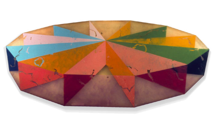
Spoke, 1968
60 1/2 x 132 inches (shaped)
Polyester Resin and Fiberglass
1. CONTRIVING A DIRECT ILLUSION OF SPACE IN DEPTH WITHOUT SHADING WHICH INCORPORATES THE FEATURES OF THE EDGE.
![]() It
is interesting that the two artists who have used this method most
fruitfully are very different in age, training and background, and
in a sense begin and end the decade, respectively. They are Hans Hofmann
and Ron Davis. Hofmann, who died in 1965, was a Cubist-Abstract-Expressionist
who did not really flower as a painter until he was over 60. He was
a great genius; in fact, I think he was the world's greatest living
painter during the first half other 1960s. Davis is a young artist
still tangling awkwardly with a very powerful style with which he
has produced a number of brilliant works in the last two or three
years. Though it seems as though Hofmann "handed the torch"
to Davis, it is clear that there is no line of influence. Instead,
they both reacted to the same necessities of the art of their time.
It is a case of parallel evolution.
It
is interesting that the two artists who have used this method most
fruitfully are very different in age, training and background, and
in a sense begin and end the decade, respectively. They are Hans Hofmann
and Ron Davis. Hofmann, who died in 1965, was a Cubist-Abstract-Expressionist
who did not really flower as a painter until he was over 60. He was
a great genius; in fact, I think he was the world's greatest living
painter during the first half other 1960s. Davis is a young artist
still tangling awkwardly with a very powerful style with which he
has produced a number of brilliant works in the last two or three
years. Though it seems as though Hofmann "handed the torch"
to Davis, it is clear that there is no line of influence. Instead,
they both reacted to the same necessities of the art of their time.
It is a case of parallel evolution.
![]() Rather
than fight the battle of side-by-side painted areas, as so many of
his colleagues did (see "De Kooning's Retrospective" in
the April, 1969, Artforum), Hofmann pulled out
a specific kind of painted area, a rectangle, which by means of its
even color and sharp, specific edge and shape seems to float in front
of the rest of the picture. The floating rectangle was a brilliant,
one-stroke solution to the problems of edge and isolation. Because
it creates a strong illusion of depth the picture surface is no longer
visually two-dimensional. The rectangles and the other elements are
free to take their place in front of or behind each other or at whatever
depth is assigned to them by the dynamics of the picture. By carefully
balancing size, shape and color intensity Hofmann made paintings in
which no part was visually isolated from any other because they could
"reach" across apparently empty space rather than across
the very resistant fully-painted flat picture surface. Furthermore,
the rectangles reflect the edge very strongly, accept it as an element
of design and bring it into the picture. This neutralizes the insistence
of the edge and has the effect of "anchoring" the painting
very strongly. Since edge-reflection is forcefully contained in one
or more "free" rectangles the colors of the rest of the
painting are called on to perform no prerequisite duties for design.
The Hofmann rectangle painting is not made like the typical Cubist
painting, by truing and fairing and aligning — that's all taken
care of by the internal edge-reflection. It is made instead by adjusting
the painting in terms of color and paint: area size, value, intensity,
hue, thickness, tactility. Thus, Hofmann used Cubism to leave Cubism
behind, as did none of the other Abstract Expressionists.
Rather
than fight the battle of side-by-side painted areas, as so many of
his colleagues did (see "De Kooning's Retrospective" in
the April, 1969, Artforum), Hofmann pulled out
a specific kind of painted area, a rectangle, which by means of its
even color and sharp, specific edge and shape seems to float in front
of the rest of the picture. The floating rectangle was a brilliant,
one-stroke solution to the problems of edge and isolation. Because
it creates a strong illusion of depth the picture surface is no longer
visually two-dimensional. The rectangles and the other elements are
free to take their place in front of or behind each other or at whatever
depth is assigned to them by the dynamics of the picture. By carefully
balancing size, shape and color intensity Hofmann made paintings in
which no part was visually isolated from any other because they could
"reach" across apparently empty space rather than across
the very resistant fully-painted flat picture surface. Furthermore,
the rectangles reflect the edge very strongly, accept it as an element
of design and bring it into the picture. This neutralizes the insistence
of the edge and has the effect of "anchoring" the painting
very strongly. Since edge-reflection is forcefully contained in one
or more "free" rectangles the colors of the rest of the
painting are called on to perform no prerequisite duties for design.
The Hofmann rectangle painting is not made like the typical Cubist
painting, by truing and fairing and aligning — that's all taken
care of by the internal edge-reflection. It is made instead by adjusting
the painting in terms of color and paint: area size, value, intensity,
hue, thickness, tactility. Thus, Hofmann used Cubism to leave Cubism
behind, as did none of the other Abstract Expressionists.
![]() Ron
Davis uses a different illusionistic device to get a similar effect.
A typical Davis looks like a large, many-sided plastic container seen
from a somewhat elevated angle. The illusion of three dimensions is
very sharp and strong. As in a Hofmann, a visual deep space is created
in which the colors, in various guises, can be anchored or suspended,
and can relate to one another across the apparently empty space created
by the illusion. The natural properties of the smooth, transparent
fiberglass surface are used to full advantage; mottled translucent
areas, spots and skeins of color come up against sets of regular opaque
areas which are often torn or scarred to give away some of the color
"behind." There is no edge problem because the edge is fully
integrated as part of the design. Though Davis is plagued by "series"
ideas, and has yet to get a grip on the inherent monumentality of
his style, he is young and inspired, and these things will evolve
naturally.
Ron
Davis uses a different illusionistic device to get a similar effect.
A typical Davis looks like a large, many-sided plastic container seen
from a somewhat elevated angle. The illusion of three dimensions is
very sharp and strong. As in a Hofmann, a visual deep space is created
in which the colors, in various guises, can be anchored or suspended,
and can relate to one another across the apparently empty space created
by the illusion. The natural properties of the smooth, transparent
fiberglass surface are used to full advantage; mottled translucent
areas, spots and skeins of color come up against sets of regular opaque
areas which are often torn or scarred to give away some of the color
"behind." There is no edge problem because the edge is fully
integrated as part of the design. Though Davis is plagued by "series"
ideas, and has yet to get a grip on the inherent monumentality of
his style, he is young and inspired, and these things will evolve
naturally.
2. VARIATION OF EDGE AND SHAPE OF CANVAS, WITH REGULAR INTERNAL EDGE REFLECTION.
![]() Though
the "shaped canvas" is one of the clichés of the
sixties, Frank Stella, who was the first to make a big issue of it,
remains the only one to handle it convincingly. He alone of the canvas-shapers
keeps the inside of his picture carefully adjusted in terms of edge
and size, so that the shape of the canvas seems to be generated from
within rather than applied as an element of design. In recent years
he has combined his glowing colors in an illusion of shallow space
by letting the colored bands surround and run in front of and behind
each other.
Though
the "shaped canvas" is one of the clichés of the
sixties, Frank Stella, who was the first to make a big issue of it,
remains the only one to handle it convincingly. He alone of the canvas-shapers
keeps the inside of his picture carefully adjusted in terms of edge
and size, so that the shape of the canvas seems to be generated from
within rather than applied as an element of design. In recent years
he has combined his glowing colors in an illusion of shallow space
by letting the colored bands surround and run in front of and behind
each other.
![]() The
paintings of Kenneth Noland, unlike all those above, stay resolutely
flat, though an occasional unsuccessful work will "buckle."
His best work, the recent horizontal "stripe" or "band"
paintings, make no concession by means of illusion to the problems
of piece-isolation. Noland's is an interesting case, probably the
only one in which pure pressure of color dictates size and shape.
Once committed to horizontal bands of color on a horizontally extended
surface, Noland has a number of overall options open to him, besides
the adjustment and variation of hue which finally "makes"
the picture. He can change the proportion of the canvas, the width
of the bands and the value of the colors. It has been my experience,
as a very rough rule-of-thumb with his pictures, that strong value
(light-dark) variation of the colors can be maintained successfully
only by reducing the number of bands, which carries as a consequence
either a widening of one or more of the individual bands or a narrowing
of the canvas horizontally. Noland has painted a few paintings which
violate this "rule." There are three reasons why they do
not provide adequately for the thorough interaction of the colors:
The
paintings of Kenneth Noland, unlike all those above, stay resolutely
flat, though an occasional unsuccessful work will "buckle."
His best work, the recent horizontal "stripe" or "band"
paintings, make no concession by means of illusion to the problems
of piece-isolation. Noland's is an interesting case, probably the
only one in which pure pressure of color dictates size and shape.
Once committed to horizontal bands of color on a horizontally extended
surface, Noland has a number of overall options open to him, besides
the adjustment and variation of hue which finally "makes"
the picture. He can change the proportion of the canvas, the width
of the bands and the value of the colors. It has been my experience,
as a very rough rule-of-thumb with his pictures, that strong value
(light-dark) variation of the colors can be maintained successfully
only by reducing the number of bands, which carries as a consequence
either a widening of one or more of the individual bands or a narrowing
of the canvas horizontally. Noland has painted a few paintings which
violate this "rule." There are three reasons why they do
not provide adequately for the thorough interaction of the colors:
a) As I have said before, when color areas are widely separated across a fully painted flat surface they tend to become isolated and lose the effect of relationship. Many regular bands mean thin, distinct areas which can easily become mutually remote as they are separate in space.
b) Strong value contrast makes areas more specific as area and therefore more susceptible to isolation.
c) Because of our visual habits a large group of horizontal stripes or bands of strong value difference will separate into groups and will begin to perform the function of value difference in nature, that is, shading, so that we get an illusion of buckling or vertical unevenness, like looking head-on at a roll top desk. Then we begin to see the picture in terms of the value, or in terms of grayness, which hinders consideration of hue difference.
![]() Noland
has defeated these problems with several devices. One is extreme variation
of band size within a picture; another is the reduction of value difference
across the picture surface. A third is an invention peculiar to Noland,
which, like Hofmann's eccentric floating rectangle, is an example
of the inventive extremes an inspired artist will take when all other
paths are blocked. It is the exaggerated horizontal extension of the
picture surface. This makes up for separation of the colors on the
surface by visually eliminating the "non-conforming" edge,
by scaling down its size and importance and by sending it to Siberia,
so to speak. Noland's paintings are extremely edge-reflective; the
horizontal edges are brought in over and over, but the vertical edges
are not. If they were, the composition would begin to be done up in
little squares and a different kind of picture would come about. If
we see a thin stripe at the bottom of a canvas and another at the
top we may see them as mutually isolated, but that isolation will
be enhanced if we are allowed to see the actual ends
of the stripes, which gives us the information that these stripes
are in fact separate units. But if these ends are held away from us
we are not allowed to make this conclusion. The horizontal limits
of the paintings become extended "buffer zones." We realize
that the same thing goes on there as in the middle, so we direct our
attention to the middle and see the stripes as integral parts of an
overall repeated pattern, the "wholeness" of which is not
disrupted by snipped-off ends. This is one reason why reproductions
of Noland's recent work are so inadequate, why we must see the painting
before us, full size.
Noland
has defeated these problems with several devices. One is extreme variation
of band size within a picture; another is the reduction of value difference
across the picture surface. A third is an invention peculiar to Noland,
which, like Hofmann's eccentric floating rectangle, is an example
of the inventive extremes an inspired artist will take when all other
paths are blocked. It is the exaggerated horizontal extension of the
picture surface. This makes up for separation of the colors on the
surface by visually eliminating the "non-conforming" edge,
by scaling down its size and importance and by sending it to Siberia,
so to speak. Noland's paintings are extremely edge-reflective; the
horizontal edges are brought in over and over, but the vertical edges
are not. If they were, the composition would begin to be done up in
little squares and a different kind of picture would come about. If
we see a thin stripe at the bottom of a canvas and another at the
top we may see them as mutually isolated, but that isolation will
be enhanced if we are allowed to see the actual ends
of the stripes, which gives us the information that these stripes
are in fact separate units. But if these ends are held away from us
we are not allowed to make this conclusion. The horizontal limits
of the paintings become extended "buffer zones." We realize
that the same thing goes on there as in the middle, so we direct our
attention to the middle and see the stripes as integral parts of an
overall repeated pattern, the "wholeness" of which is not
disrupted by snipped-off ends. This is one reason why reproductions
of Noland's recent work are so inadequate, why we must see the painting
before us, full size.
3. REDUCTION OF SPECIFICITY OF SHAPE.
![]() The
most specific shape is a large one which contrasts strongly with its
surroundings. This kind of shape is most susceptible to the problems
of isolation and edge because it inhabits an area very definitely
and because the strength of its own edge forces comparison to that
of the canvas. Two clear methods to reduce the definiteness of shape
are to reduce value difference between shapes and to reduce the size
of shapes. Noland has made a number of horizontal stripe paintings
which bring the value of the colors very close together. This induces
a uniformity of surface, despite the clean-cut character of the stripes,
because the absence of strong value differences lets us see the picture
as a whole unit, all at once. Hue variation is independent from value
in this format and the painting can be carried by a wide range of
hue within the very similar value.
The
most specific shape is a large one which contrasts strongly with its
surroundings. This kind of shape is most susceptible to the problems
of isolation and edge because it inhabits an area very definitely
and because the strength of its own edge forces comparison to that
of the canvas. Two clear methods to reduce the definiteness of shape
are to reduce value difference between shapes and to reduce the size
of shapes. Noland has made a number of horizontal stripe paintings
which bring the value of the colors very close together. This induces
a uniformity of surface, despite the clean-cut character of the stripes,
because the absence of strong value differences lets us see the picture
as a whole unit, all at once. Hue variation is independent from value
in this format and the painting can be carried by a wide range of
hue within the very similar value.
![]() By
"atomizing" his paint, Jules Olitski has reduced the painted
shape so much that it no longer figures as shape. This is a solution
for color painting similar to that of Pollock's for space painting.
As I have said, color must have surface, must spread out to present
itself fully, and covering closes off the surface and isolates shapes.
By atomizing his paint Olitski has given his surface opaque color
and transparency at the same time. If you spatter red paint on a white
piece of paper, the result will be a surface occupied by red but not
covered by it. If a similar shot of green is applied the same effect
will be gained. The result is that the two colors extend across the
surface, are visible and contrasting all over that surface, but do
not literally cover it. It is not possible for two colors to each
completely cover a surface and remain visible. Furthermore, the colors
get at one another in proportion to the degree of fragmentation because
there is more edge-per-color available the more divided the color
is. This ratio of available surface of equivalent volumes according
to the degree of disintegration is a well-known fact in physics, and
it works for art as well. Olitski plays these clouds of powdered color
over his surfaces just as Pollock strung out his nets of painted line,
varying the concentration here and there. Though he usually keeps
values close, the value differences which do exist take over through
the fog, and the colors can take their place in the various shadowy
depths induced by those value differences or sit opaquely on the surface.
Because of the compensations made by the other factors of his style
Olitski has not chosen to go to explicit depth illusion; it is enough
for him to suggest it, softly, here and there, so that we know it
is there, kept in reserve, backing up the painting.
By
"atomizing" his paint, Jules Olitski has reduced the painted
shape so much that it no longer figures as shape. This is a solution
for color painting similar to that of Pollock's for space painting.
As I have said, color must have surface, must spread out to present
itself fully, and covering closes off the surface and isolates shapes.
By atomizing his paint Olitski has given his surface opaque color
and transparency at the same time. If you spatter red paint on a white
piece of paper, the result will be a surface occupied by red but not
covered by it. If a similar shot of green is applied the same effect
will be gained. The result is that the two colors extend across the
surface, are visible and contrasting all over that surface, but do
not literally cover it. It is not possible for two colors to each
completely cover a surface and remain visible. Furthermore, the colors
get at one another in proportion to the degree of fragmentation because
there is more edge-per-color available the more divided the color
is. This ratio of available surface of equivalent volumes according
to the degree of disintegration is a well-known fact in physics, and
it works for art as well. Olitski plays these clouds of powdered color
over his surfaces just as Pollock strung out his nets of painted line,
varying the concentration here and there. Though he usually keeps
values close, the value differences which do exist take over through
the fog, and the colors can take their place in the various shadowy
depths induced by those value differences or sit opaquely on the surface.
Because of the compensations made by the other factors of his style
Olitski has not chosen to go to explicit depth illusion; it is enough
for him to suggest it, softly, here and there, so that we know it
is there, kept in reserve, backing up the painting.
![]() Olitski
is obliged to do something about the edge because the pale, close-value
surface can close up and turn the painting into a big flat object
very easily, and this would force visual consideration away from the
painting. Internal repetition of the edge would quite evidently interfere
with the quality and mechanics of his surface. But the atomized shape
is so subdued as shape, the colors so delicately uniform across the
surface, that strong edge-repetition is not needed; there is nothing
inside the painting which calls for it. Olitski simply brings the
edge in along one side, or goes around a corner, by masking off a
value difference or by drawing a rough and often highly colored line.
This declares the painting as a painting, stays out of its "body"
and carries in other colors.
Olitski
is obliged to do something about the edge because the pale, close-value
surface can close up and turn the painting into a big flat object
very easily, and this would force visual consideration away from the
painting. Internal repetition of the edge would quite evidently interfere
with the quality and mechanics of his surface. But the atomized shape
is so subdued as shape, the colors so delicately uniform across the
surface, that strong edge-repetition is not needed; there is nothing
inside the painting which calls for it. Olitski simply brings the
edge in along one side, or goes around a corner, by masking off a
value difference or by drawing a rough and often highly colored line.
This declares the painting as a painting, stays out of its "body"
and carries in other colors.
![]() There
is a "feel" about these mechanics which I can't put properly
into words. When I think hard about these paintings, as I have, some
of these simple, seemingly arbitrary solutions to pictorial problems
jump up and become more than they really are, become human. Hofmann's
rectangle, Noland's stretched-out canvas and Olitski's random edge
decoration all have that sense of mental "leap" which scientists
describe when, after years of pushing and straining at a problem the
answer comes down out of nowhere in all clarity. The effect is different,
because to the scientist the answer is the result, while to the artist
it is only a kind of license to get along and show his stuff. But
there is a sameness of the quality of thought.
There
is a "feel" about these mechanics which I can't put properly
into words. When I think hard about these paintings, as I have, some
of these simple, seemingly arbitrary solutions to pictorial problems
jump up and become more than they really are, become human. Hofmann's
rectangle, Noland's stretched-out canvas and Olitski's random edge
decoration all have that sense of mental "leap" which scientists
describe when, after years of pushing and straining at a problem the
answer comes down out of nowhere in all clarity. The effect is different,
because to the scientist the answer is the result, while to the artist
it is only a kind of license to get along and show his stuff. But
there is a sameness of the quality of thought.
![]() These
are other artists of the sixties who have painted very good paintings
with other means. Helen Frankenthaler, for example, compensates for
edge and isolation by lining up her images with the edge and by keeping
the colors bright, the areas simple and separate and the space wide
open. The color areas are strong and distinct and relate easily across
the unmodulated raw canvas. Larry Poons, though he has changed his
style very much recently, is best known for his paintings of small,
regularly arranged colored dots or ovals on a colored surface. According
to the picture, these colored bits are surrounded by the colored surface
or, because they can be organized into precise systems across the
surface, jump in front of the surface as separate entities, as if
each set of dots was laid out precisely on a sheet of clear plastic
held up in front of the colored canvas. There are many other very
fine painters I have not brought up here because this essay is about
techniques, not artists; it is about a few of the methods some artists
have used to get color into their painting and it is not meant as
a compendium of good artists. Furthermore, the use of these art-making
procedures does not insure art quality. Though apparently necessary,
they are only foundations. My point is that no matter how wild it
looks, great art is always securely built. These are notes about the
strength of the skeleton, not the beauty of the flesh.
These
are other artists of the sixties who have painted very good paintings
with other means. Helen Frankenthaler, for example, compensates for
edge and isolation by lining up her images with the edge and by keeping
the colors bright, the areas simple and separate and the space wide
open. The color areas are strong and distinct and relate easily across
the unmodulated raw canvas. Larry Poons, though he has changed his
style very much recently, is best known for his paintings of small,
regularly arranged colored dots or ovals on a colored surface. According
to the picture, these colored bits are surrounded by the colored surface
or, because they can be organized into precise systems across the
surface, jump in front of the surface as separate entities, as if
each set of dots was laid out precisely on a sheet of clear plastic
held up in front of the colored canvas. There are many other very
fine painters I have not brought up here because this essay is about
techniques, not artists; it is about a few of the methods some artists
have used to get color into their painting and it is not meant as
a compendium of good artists. Furthermore, the use of these art-making
procedures does not insure art quality. Though apparently necessary,
they are only foundations. My point is that no matter how wild it
looks, great art is always securely built. These are notes about the
strength of the skeleton, not the beauty of the flesh.
![]() Despite
all the "new" materials brought into art and the consequent
silly talk about the decline and imminent death of painting, I think
we are just getting started, that in the sixties we have taken the
first moves of the first great burst of real abstract painting. The
new art, its roots deep in the great art of the recent past, will
leave behind it the frivolity and fussiness of the fad styles of the
sixties and the puritan restrictions of Old Mother Cubism. It will
be as bright as it is balanced, as permissive as it is secure, a natural
art embracing all the natural materials of painting, an American analog
to the beautiful painting of the French Impressionists a hundred years
behind us.
Despite
all the "new" materials brought into art and the consequent
silly talk about the decline and imminent death of painting, I think
we are just getting started, that in the sixties we have taken the
first moves of the first great burst of real abstract painting. The
new art, its roots deep in the great art of the recent past, will
leave behind it the frivolity and fussiness of the fad styles of the
sixties and the puritan restrictions of Old Mother Cubism. It will
be as bright as it is balanced, as permissive as it is secure, a natural
art embracing all the natural materials of painting, an American analog
to the beautiful painting of the French Impressionists a hundred years
behind us.
*
I will not try to justify this flat statement (except to ask the reader to refer to my article, "Present-Day Art and Ready-Made Styles" in the December, 1966 issue of this magazine) because I have confidence that time passing will do the job for me. This is also a good point to say that this essay is based on a lecture I gave recently, and is more general and less tightly worked-out than my other writing in this magazine. In the form given here it is an outline, full here and thin there, which could and perhaps should be made complete in time to come.
**
|
|
|
|